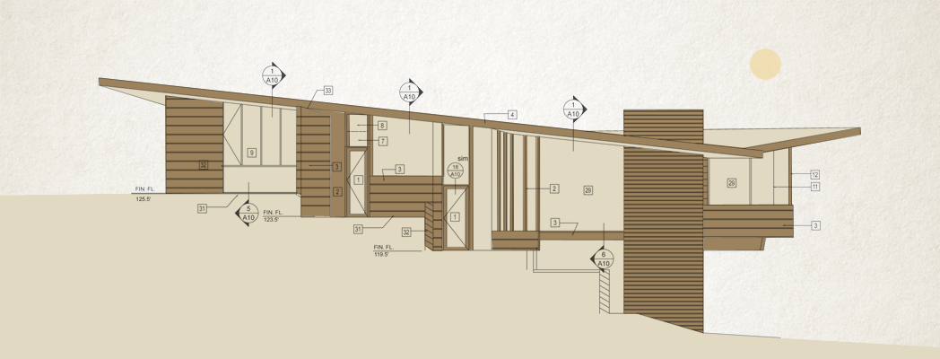
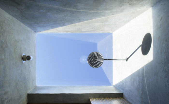
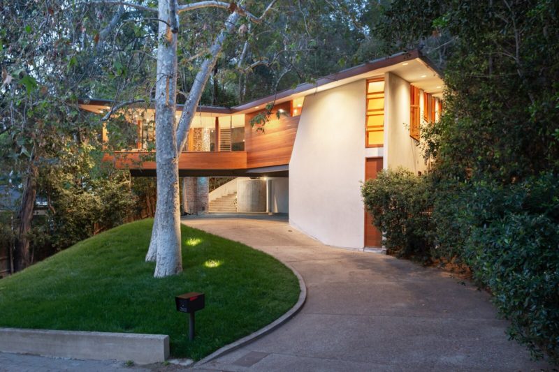
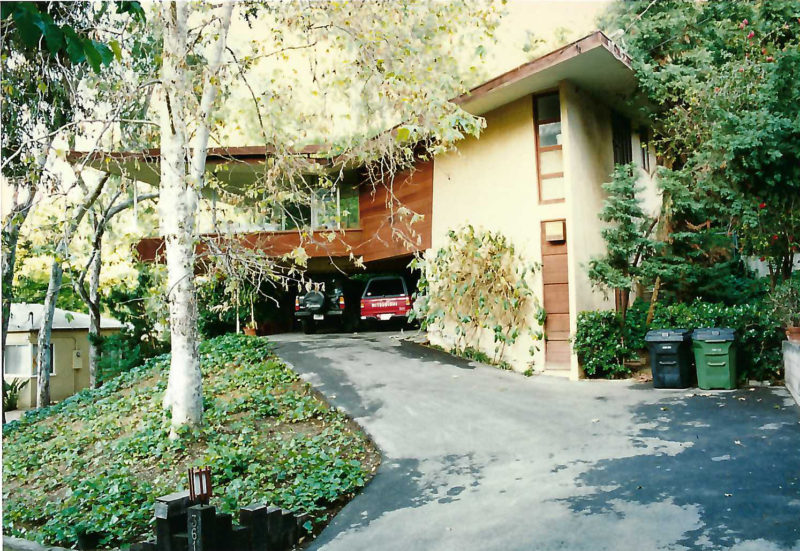
If you follow Tracy A. Stone Architect on Instagram, you may have noticed that we recently got to visit John Lautner’s Tyler House. Tucked away in L.A.’s Laurel Canyon, this lesser-known work was built in 1953 and then restored in 1995, with the help of our very own Tracy Stone. The owner, Peter Tangen, was a perfect steward for this home renovation and along with the contractor, Sid Loving, helped create a collaborative design team. Not to toot our own horn, but we think the renovation of this gem has stood the test of time and in many ways has enhanced the original house.
This renovation got us thinking: What makes a mid-century modern renovation successful? As we browse mid-century remodels on Dwell’s Before & After section, we can’t help but notice this recurring negative comment: “Why would they do that? They lost all the original character.”
So how do you avoid unintentionally stripping your home of its charm to the point of no return?
1. Preserve the “Timeless” Mid-Century Features
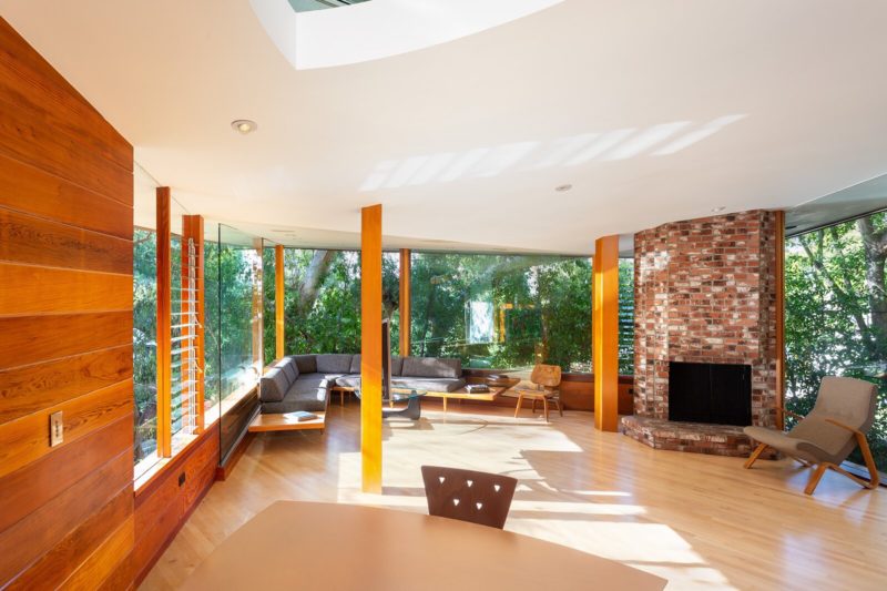
The Mid-century Modern era is considered to be post-WWII and lasting into the late 1960s. The architectural characteristics vary geographically, but common features found in mid-century homes include horizontal lines, open floor plans, post-and-beam structures, natural materials, and large windows that connected the inside to the outside. With today’s building codes and energy standards, it’s difficult to recreate some of these features so, in any renovation, we’d highly recommend keeping them as much as possible. Once they’re gone, there’s no turning back.
When it comes to your own mid-century home, here are a few features worth preserving:
- Floor-to-ceiling windows
- Wood-burning fireplaces
- Exposed beams and wood ceilings
- Wood surfaces with natural finishes (paneling, siding, etc.)
- Original built-in storage
2. Have a Consistent Design Language
It is inevitable when renovating a mid-century home that you will have to modify it, demo certain things, and hopefully rip out that shag carpet. Many mid-century homes have endured their fair share of unfortunate ‘80s renovations and it’s your job to listen to your house and see the intended design language.
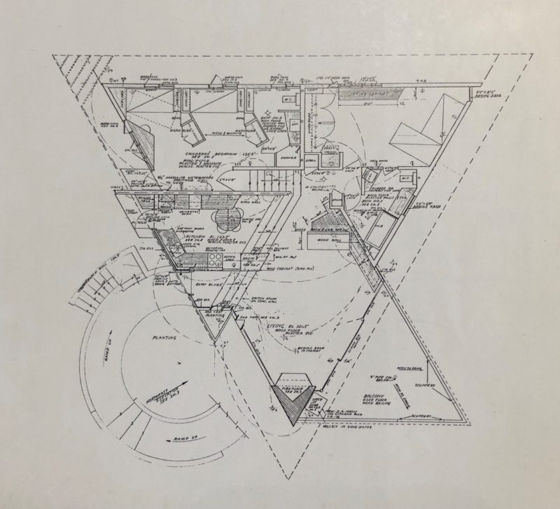
One of the reasons the Tyler House was successful in maintaining its character was because the design language was easily identified and then balanced with modern conveniences. As mentioned above, the Tyler House was built in 1950 and is considered to be an “early work” of Lautner’s after starting his own practice. The original home had a very modest budget at the time of construction and lacked the craftsmanship that the house exhibits today.
The main design feature of the Tyler House is its triangular floor plan. During the renovations, Tracy and Peter continued the theme of triangular shapes by adding a frameless triangular skylight, a triangular shower, and custom triangular dining table. Another notable feature added during the renovation: the large windowpanes at the sharp corner of the main “living” triangle. These new expansive panes of glass slide open to the surrounding trees, and when Peter resided there, stayed open nearly year-round for the ultimate indoor/outdoor living experiences. This feature was directly inspired by one of Lautner’s other triangular masterpieces: the Sheats-Goldstein Residence.
Other features and design changes that respect the house’s original design language:
- Continuing the redwood siding throughout the house
- Adding floor-to-ceiling windows where suitable
It is fair to mention that not everyone has a mid-century home that has a prominent design language and precedent like the Tyler House. Does your home have original terrazzo floors? Try to continue that in other areas of the home. Does your home have clerestory windows? Use clerestory windows as a design feature for an addition. Does your home have original walnut paneling? Embrace that wood paneling and maybe even add some more.
3. Respect the Honesty of Materials and Structure
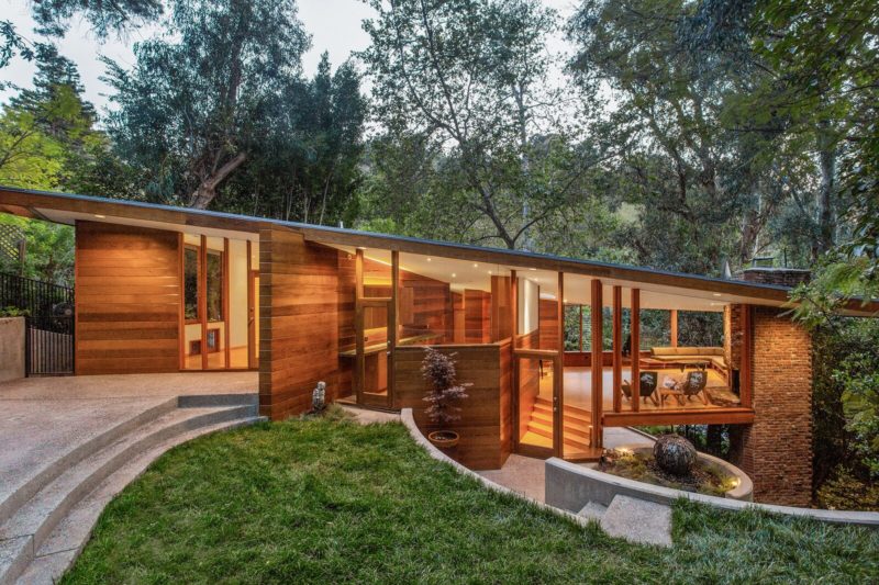
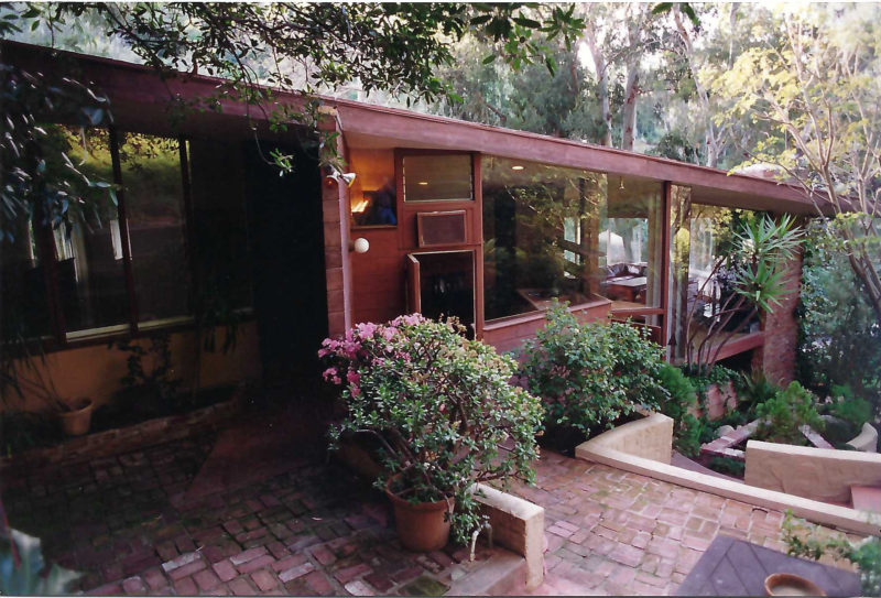
One of the key features of mid-century design is its simplicity and use of natural materials. You will not see an excess of ornamentation, but rather stripped-down elements that show their function. Mid-century design relies on wood, metal, concrete, and greenery to speak for itself.
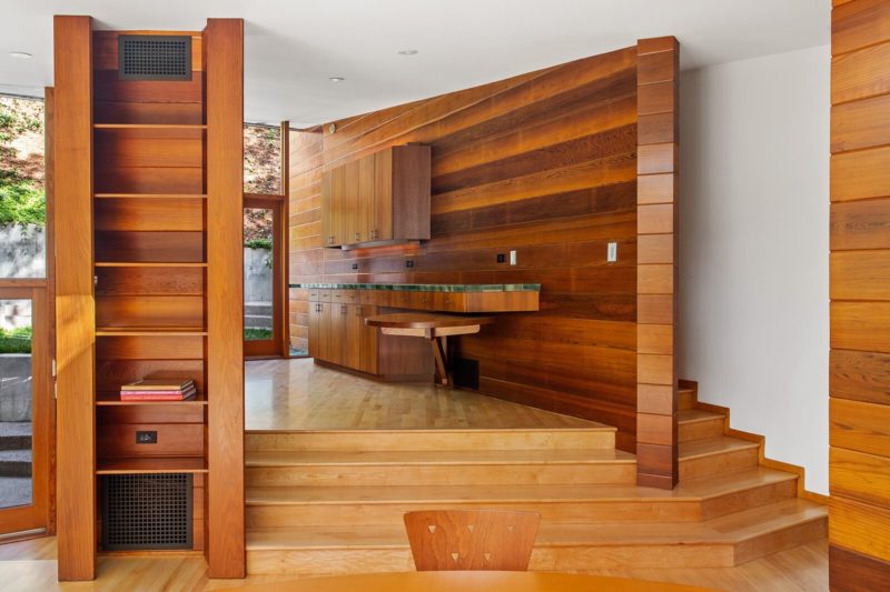
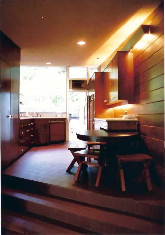
When we say an “honesty of materials,” we mean let wood be wood. Let concrete be rough and declare that it’s concrete.
Some ways to stay true to materials and structure:
- Do not cover up structure (exposed beams, columns, etc.)
- Do not paint over original masonry or wood paneling
- Stay away from ornamentation and excessive trim
- Open the space to the outside where possible
As you can see in the images, the Tyler House, under Peter’s mindful design stewardship, has maintained the essence of a Mid-century Modern home. And in many instances, the design and material quality have been improved. The Tyler House is now passing to a new owner who one hopes will love and care for it through the next decades. Thank you to Peter for including us in all the recent Tyler House hype and letting us visit this time-tested mid-century home. It’s still as beautiful as when it finished construction in the ‘50s.
If you, or anyone you know, is considering a mid-century home renovation, we’d love to join forces to help identify the design language and enhance the mid-century features already encompassed in the home.

